digital application
digital application
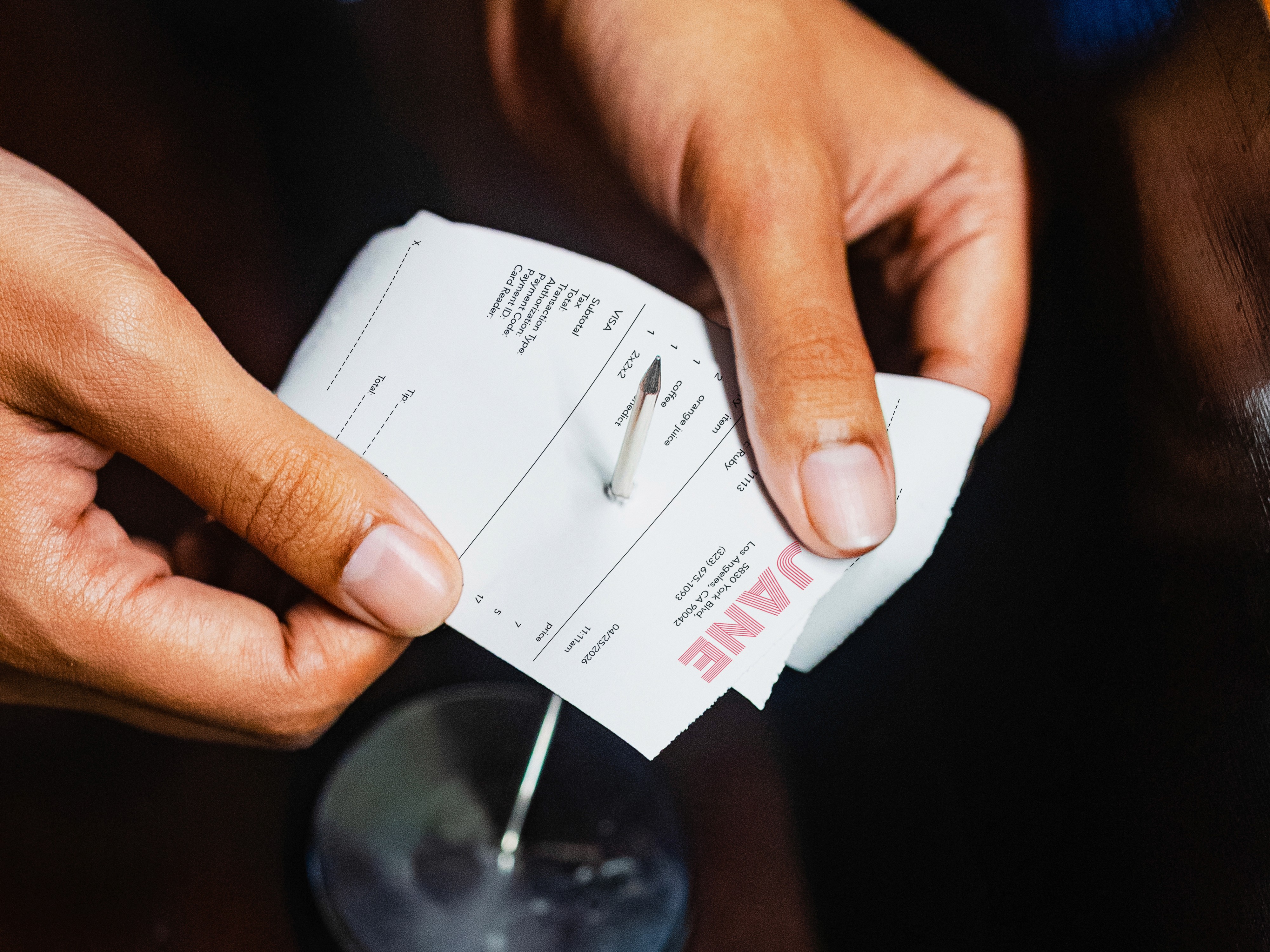
receipt
receipt
to-go packaging
to-go packaging
to-go packaging
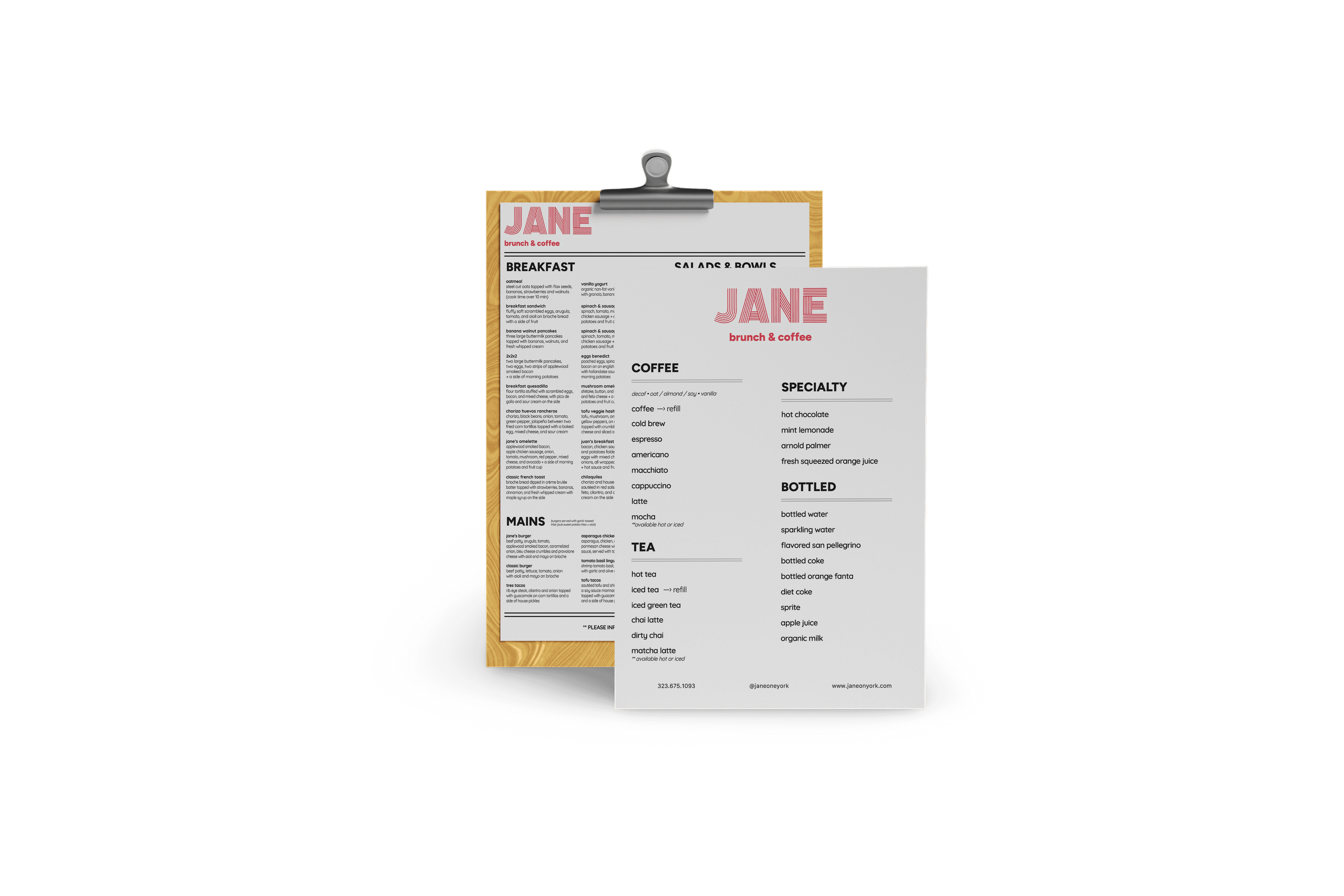
menu
menu
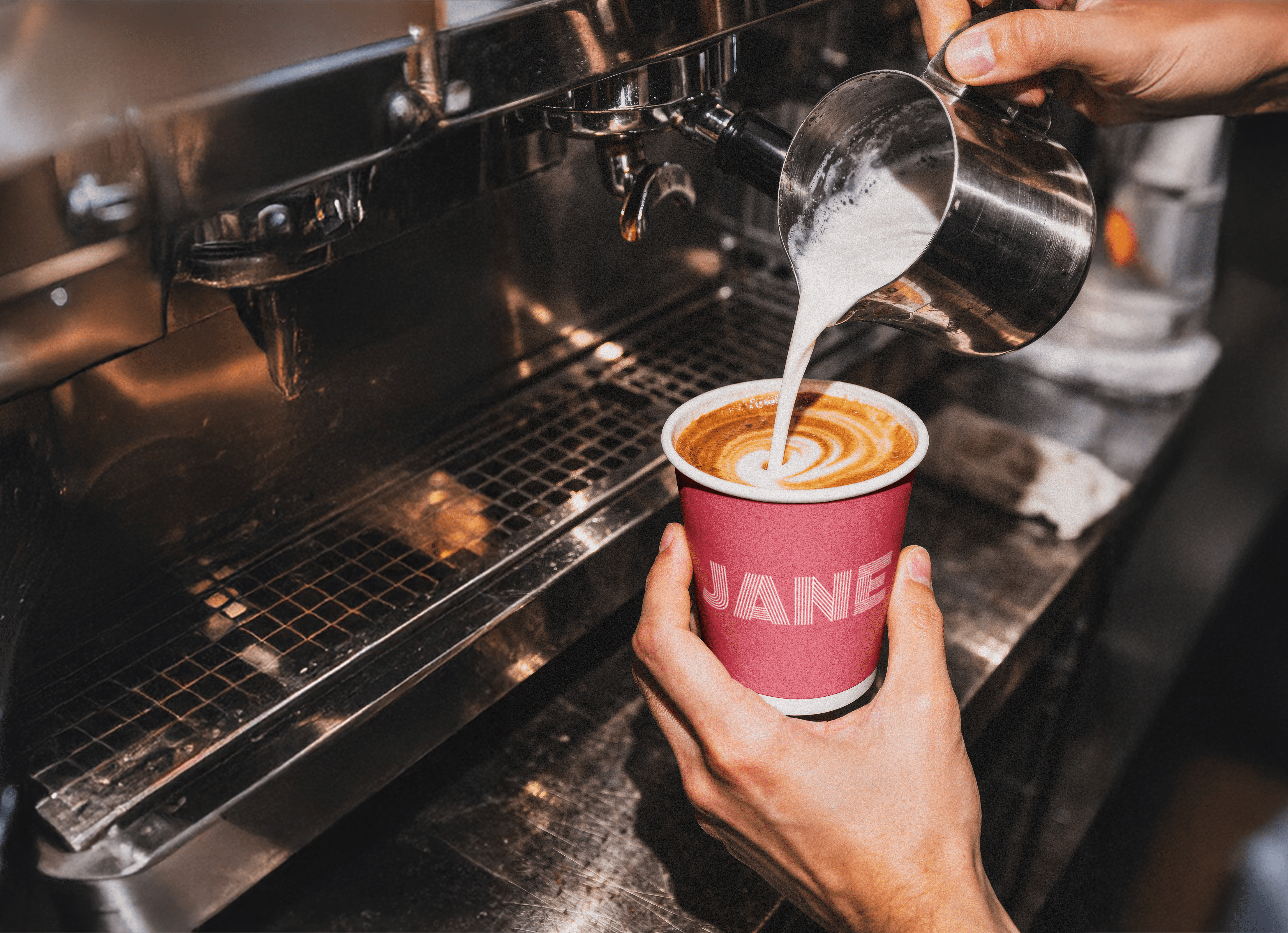
coffee cup
coffee cup
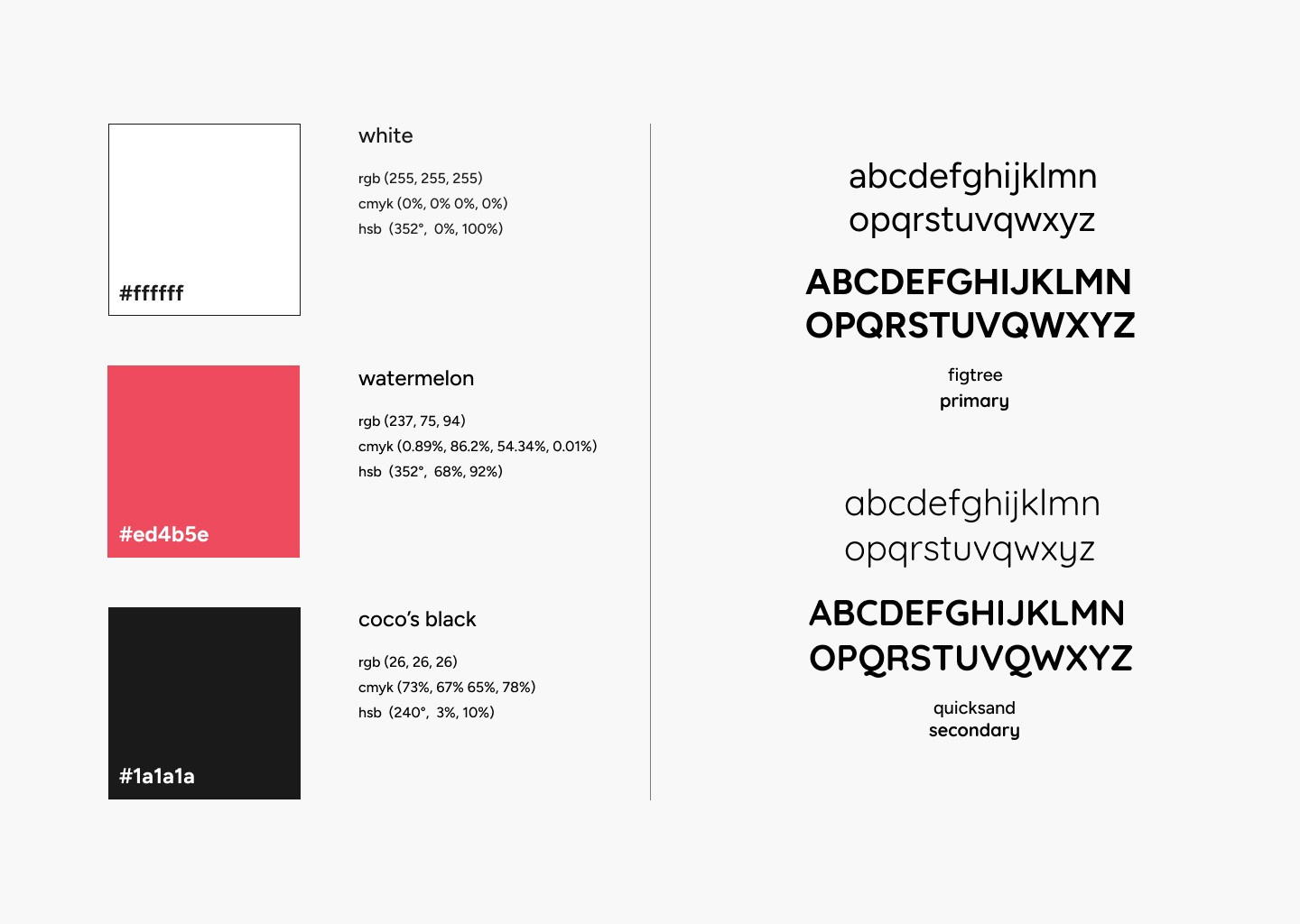
brand colors and typography
brand colors and typography
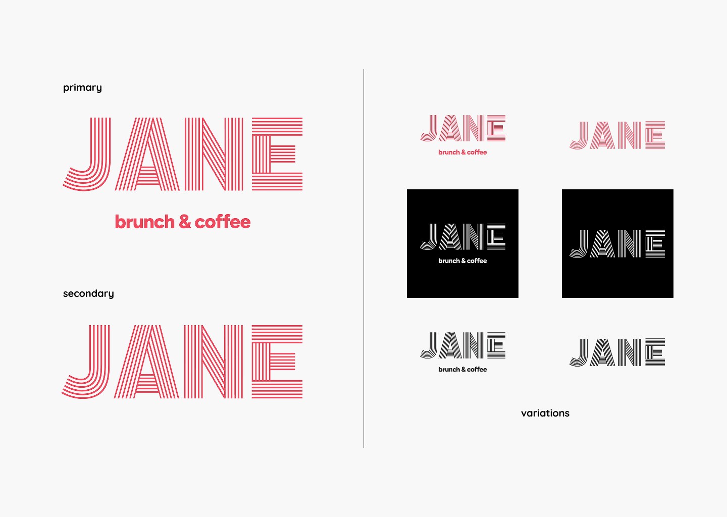
logo variation
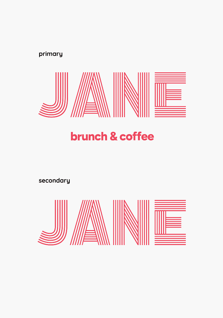
logo variation
Café Jane
2026
Café Jane (known locally as Jane on York) is a neighborhood café with a strong sense of atmosphere, but its existing branding felt generic and disconnected from the experience of the space.
This rebrand approaches the identity as a system rather than a collection of elements, using typography, spacing, and repetition to create consistency across menus, signage, and digital touchpoints. Rather than relying on heavy graphics, the design focuses on restraint and clarity, allowing small details to carry the identity. The result is a brand that feels warm, familiar, and quietly distinct.
Café Jane (known locally as Jane on York) is a neighborhood café with a strong sense of atmosphere, but its existing branding felt generic and disconnected from the experience of the space.
This rebrand approaches the identity as a system rather than a collection of elements, using typography, spacing, and repetition to create consistency across menus, signage, and digital touchpoints. Rather than relying on heavy graphics, the design focuses on restraint and clarity, allowing small details to carry the identity. The result is a brand that feels warm, familiar, and quietly distinct.
brand identity
typography
art direction
visual systems
layout design
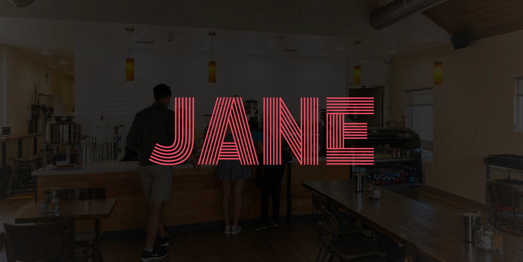
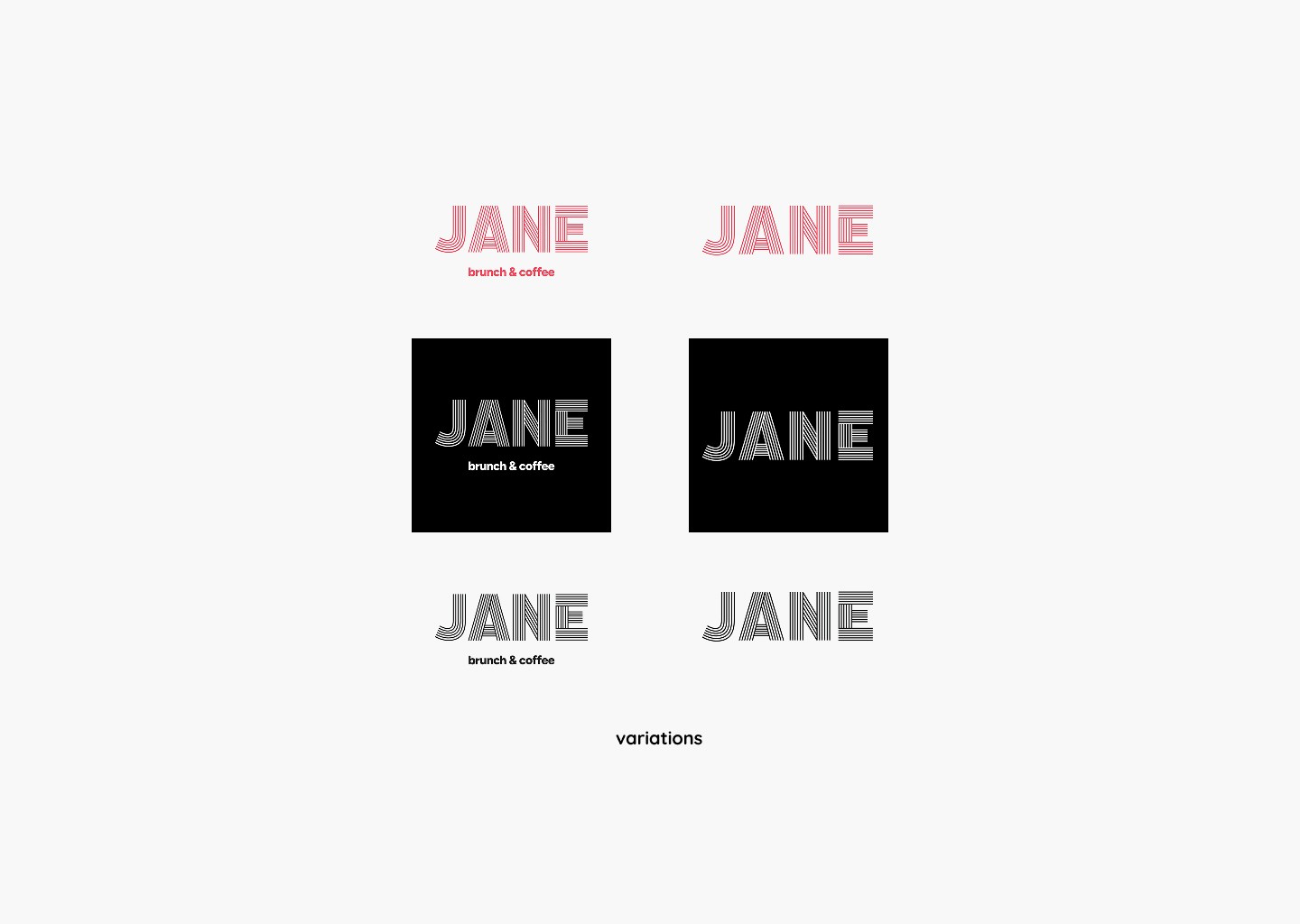
logo variation
logo variation