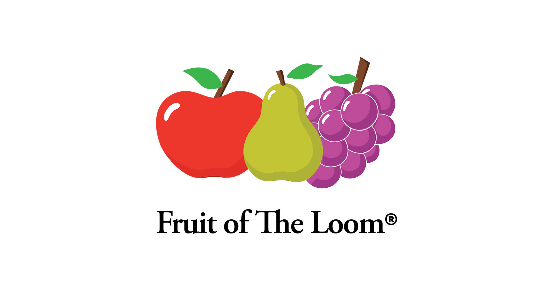
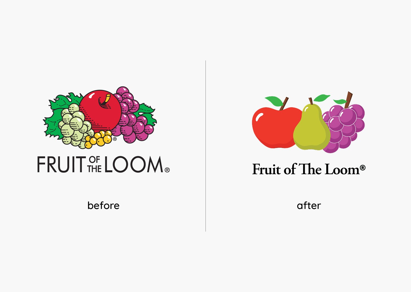
This project reimagines the Fruit of the Loom logo through refinement rather than reinvention. The original mark is highly recognizable but visually dense, with multiple elements competing for attention.
The redesign focuses on simplifying form and improving composition to create a cleaner and more cohesive mark. By adjusting shape, spacing, and color relationships, the updated logo feels more adaptable across contemporary applications while maintaining the familiarity of the original.
brand identity
logo design
art direction
visual systems
layout design

billboard
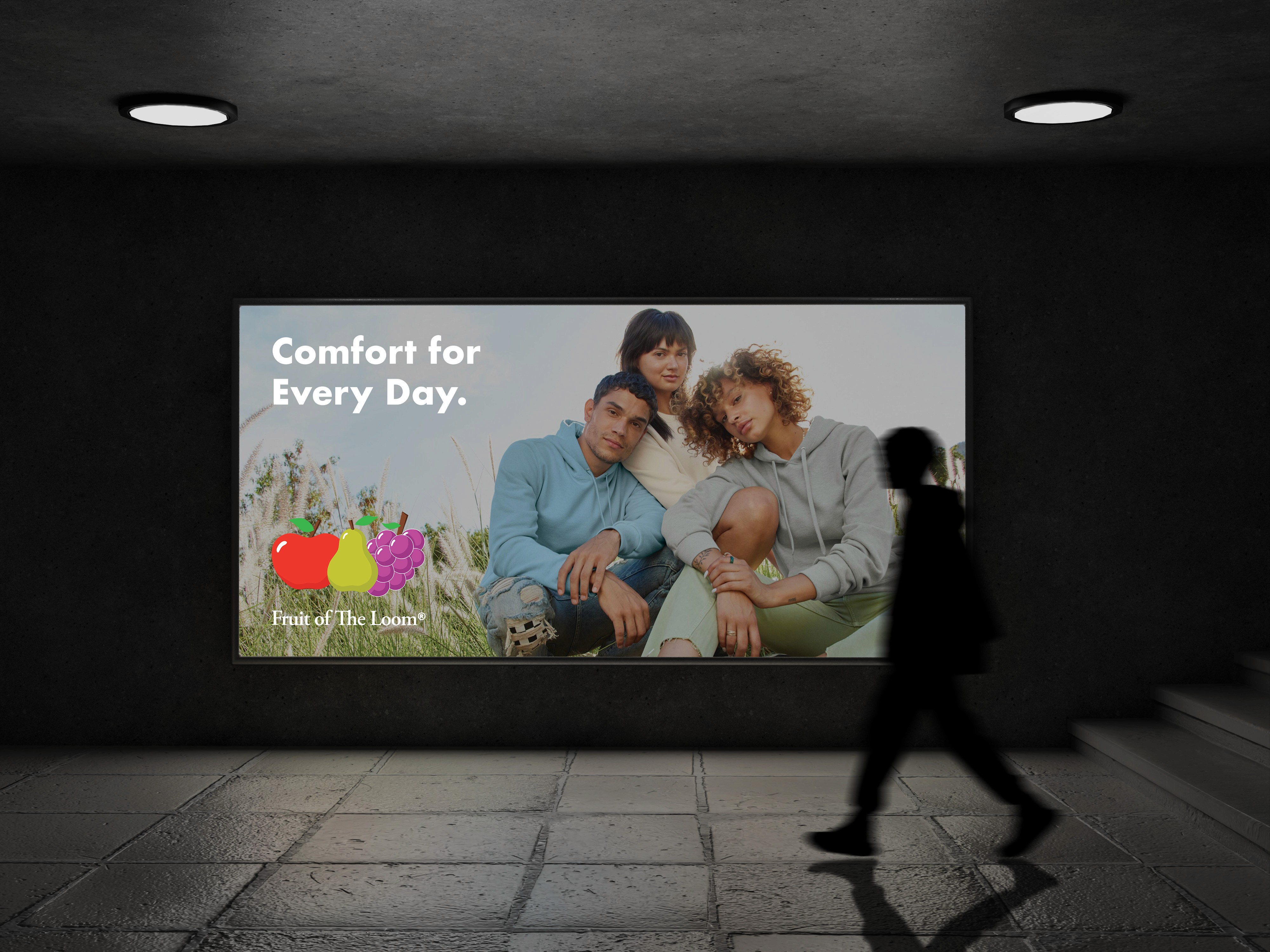
transit advertising
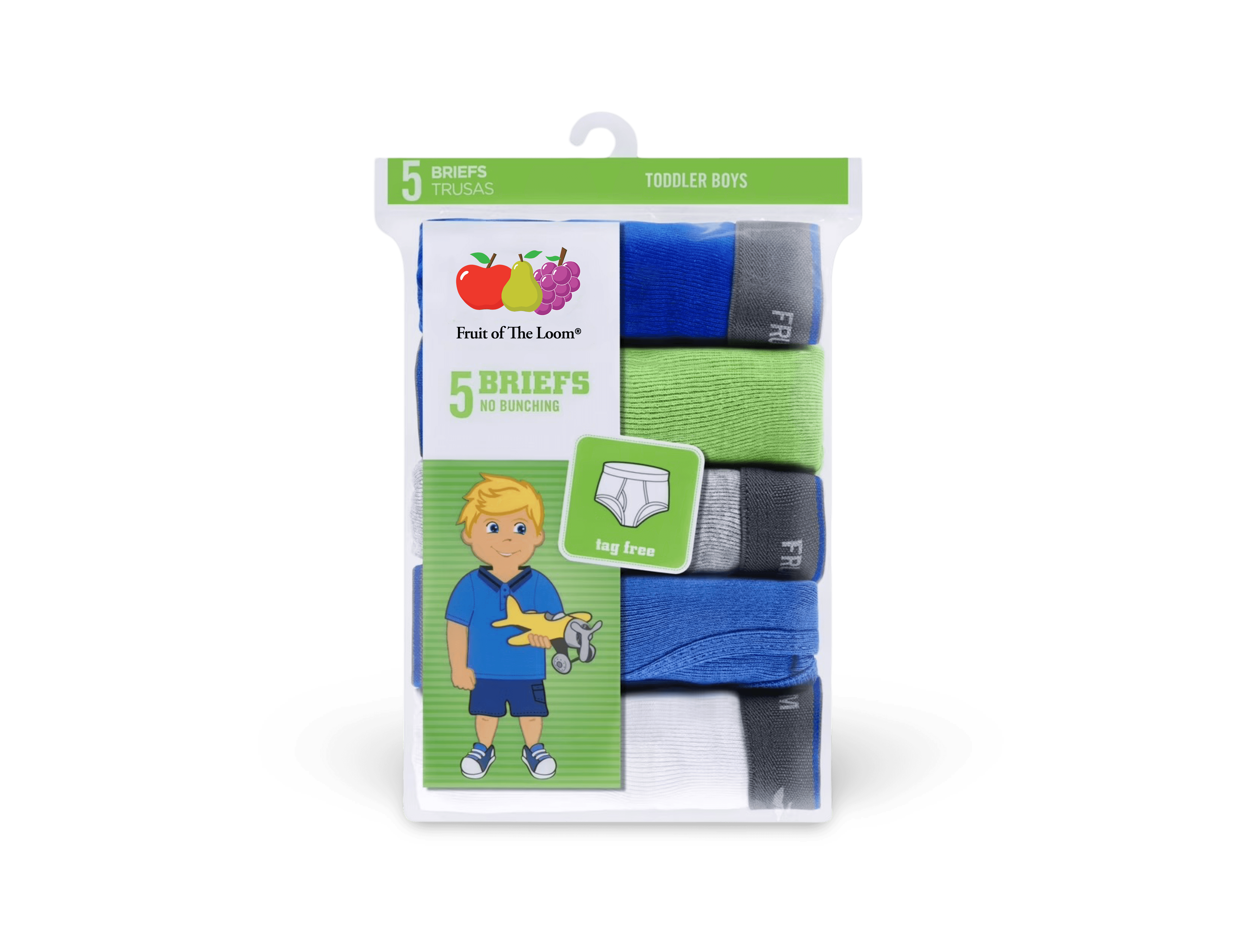
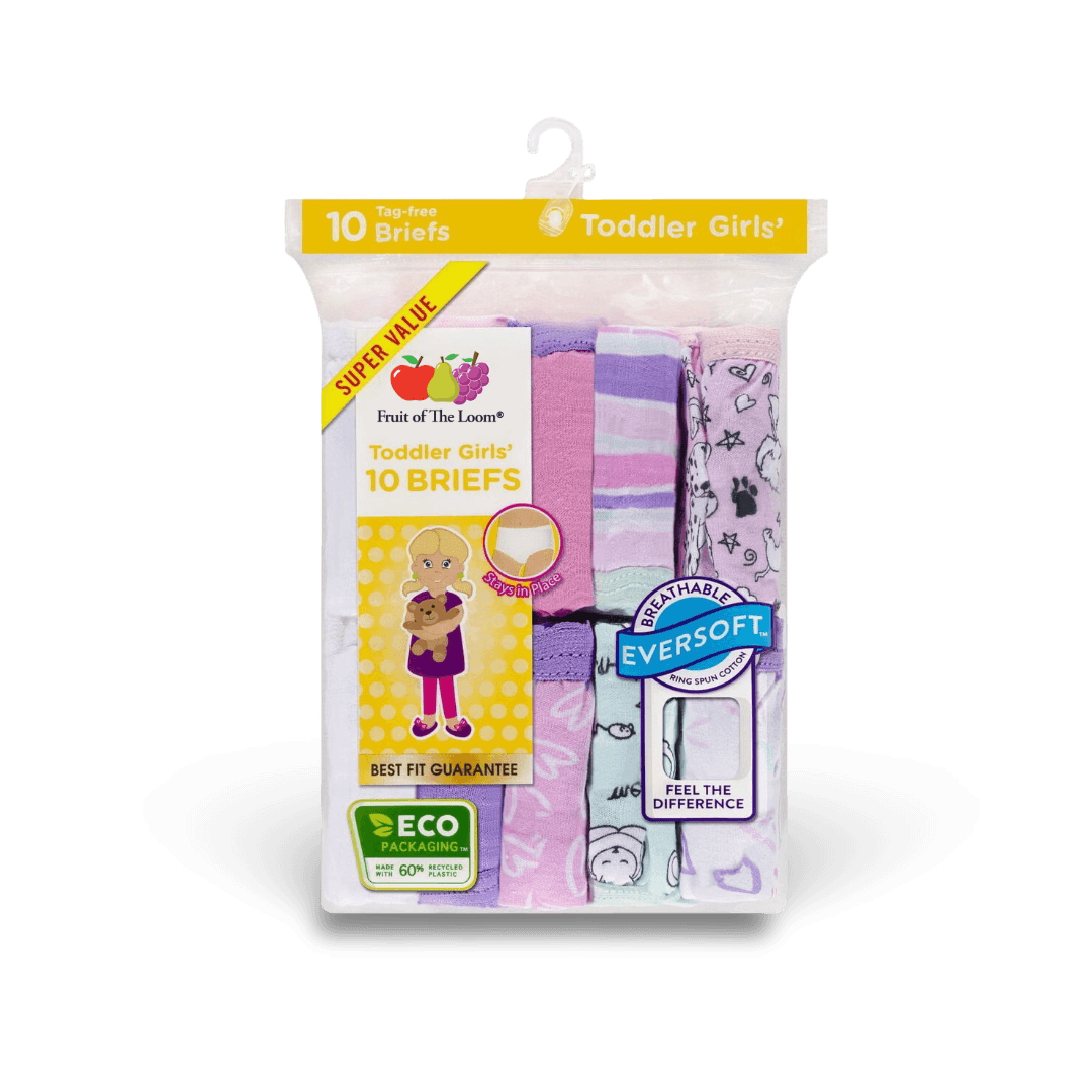
product packaging
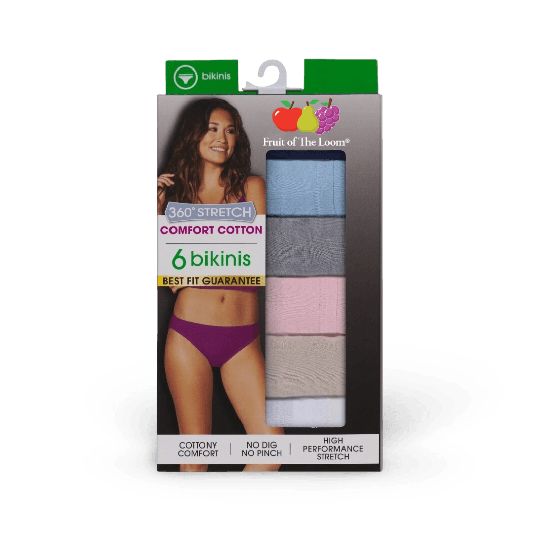
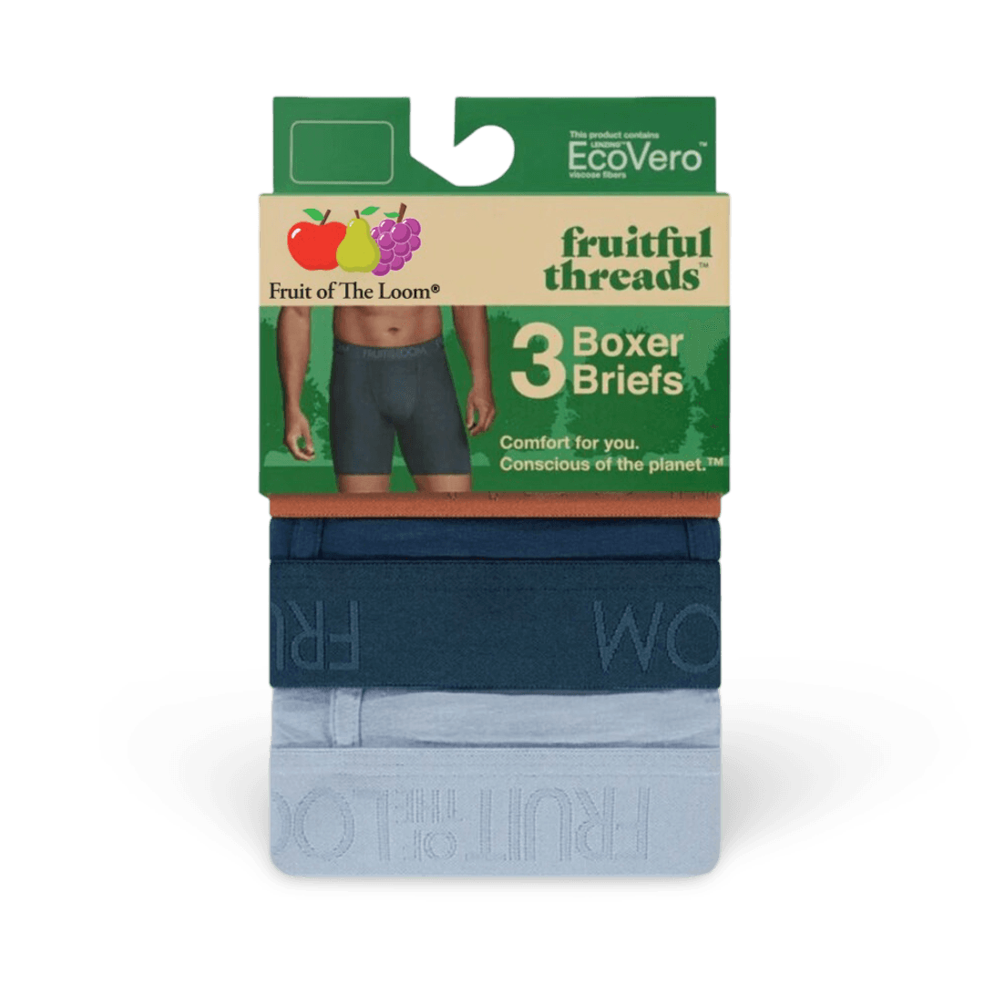
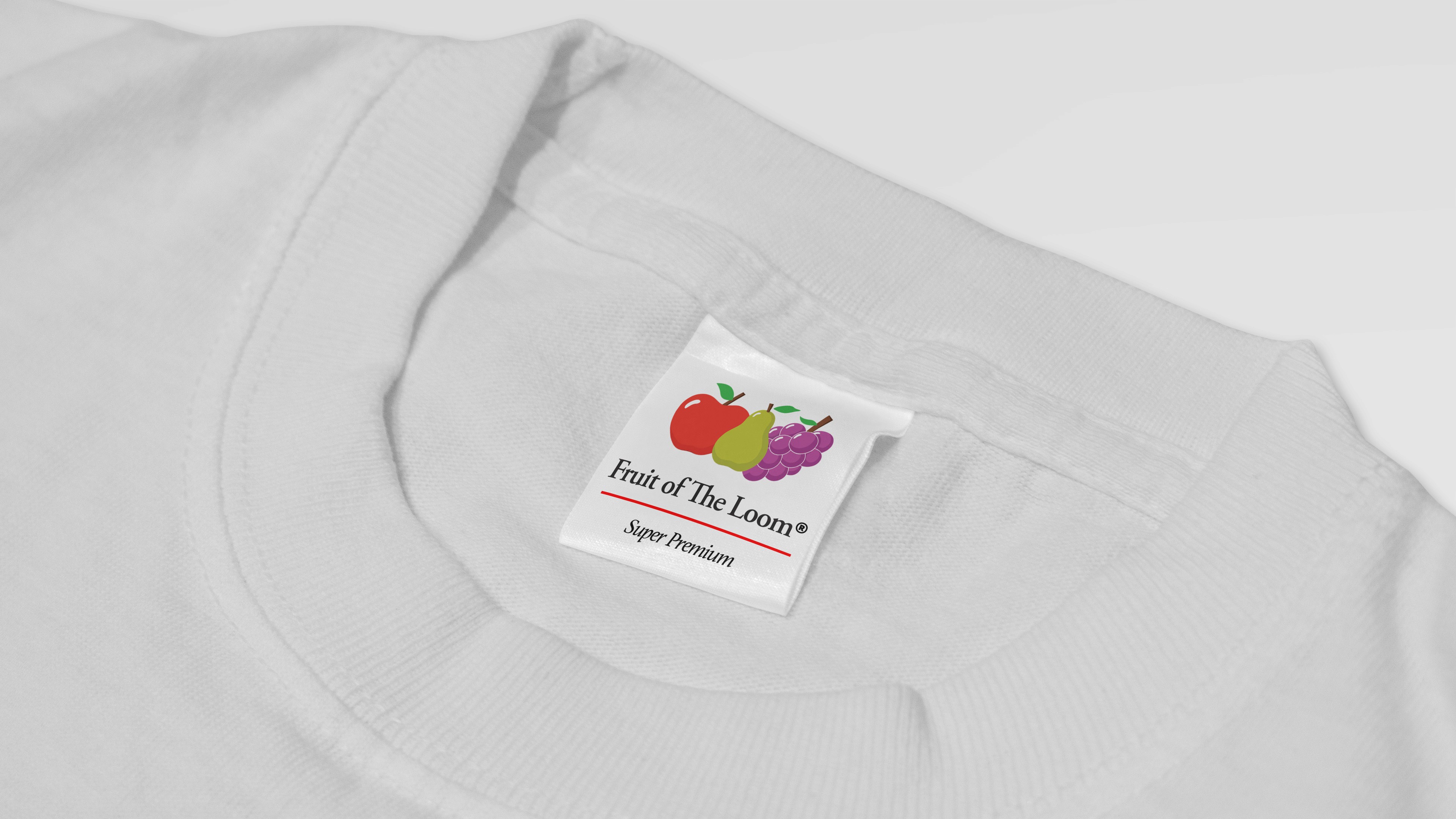
garment tag
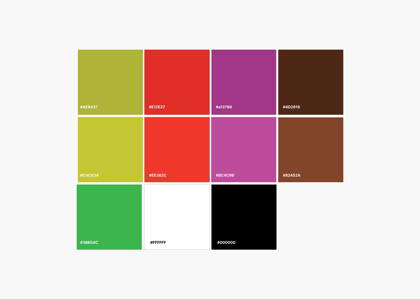
color palette
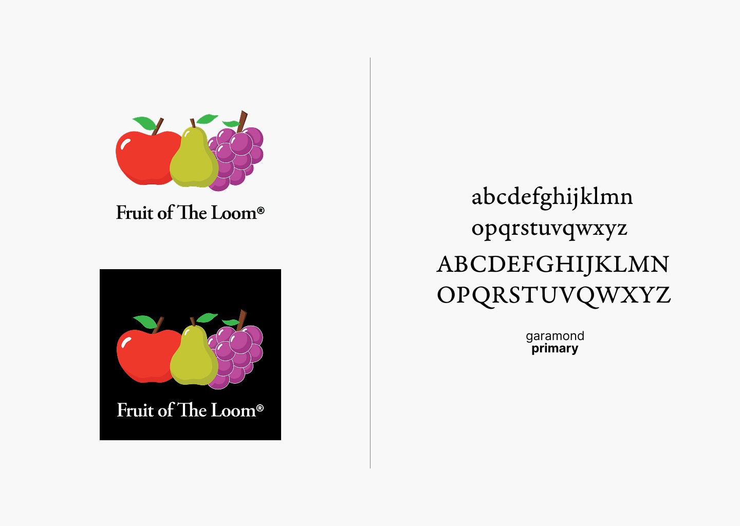
logo variation and brand typography
Fruit of the loom
2026